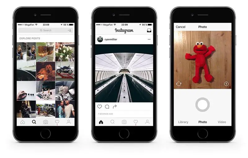
Instagram is the home of great imagery, fashion photography and good design. When it comes to its own interface though, the company has shown little interest in revamping the look of its apps over the years.
This could be about to change though. Some users have spotted a new design being tested. And what’s even more surprising… it’s monochromatic – yes. As in… black and white.
[box]Also Read: Instagram.com Is Almost A Real Social Platform Now[/box]
The new design was first brought to our attention by Instagram user Anton Abramov. His Instagram interface has turned black-and-white. The icons have also received a slight makeover, suggesting Instagram may move towards unifying its design across iOS and Android.
If you like our stories, there is an easy way to stay updated:
Follow @wersm

While this redesign might seem trivial, moving towards a monochromatic design could well help users focus their attention on the images themselves, helping them look more colourful and a bit brighter, by avoiding any potential colour clashes.
A Facebook spokesperson has confirmed this is an actual test:
[quote]We often test new experiences with a small percentage of the global community. This is a design test only.[/quote]
What do you think of it?
