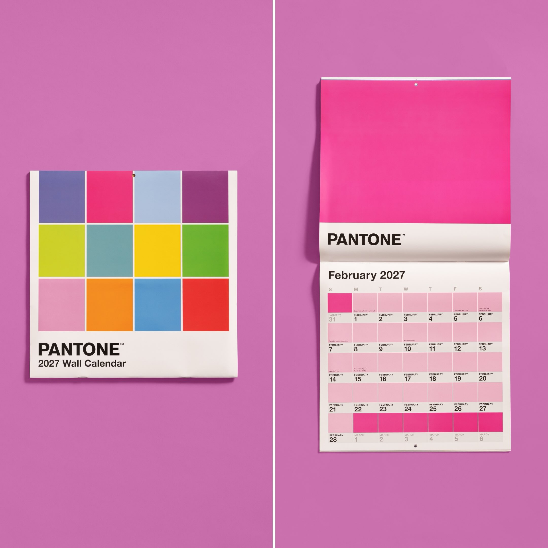
Most calendars tell you what day it is. Pantone’s new one also tells you what color it should be.
For 2027, Pantone has partnered with Workman Publishing on a collection of calendars built entirely around its iconic color-chip design, including a desktop edition featuring a different shade for every day of the year.
365 Days, 365 Colors
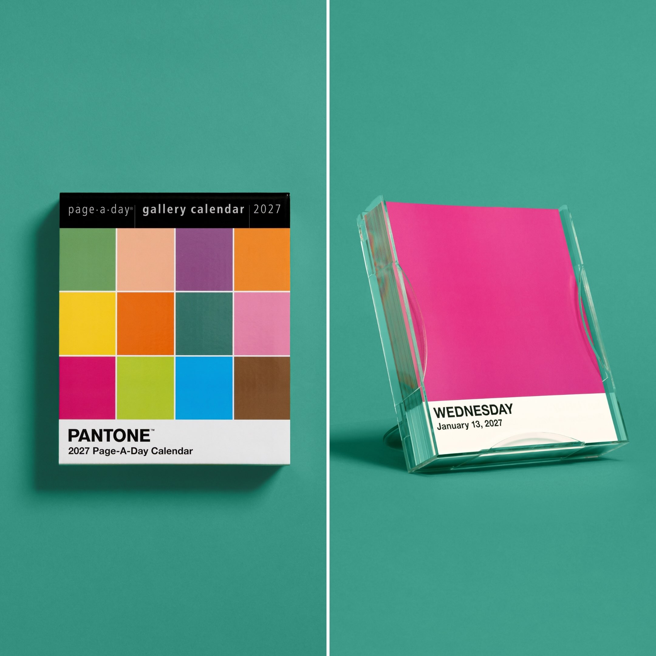
The Pantone Page-A-Day Gallery Calendar turns the familiar swatch into 365 detachable pages, each featuring a different shade, tone or hue. The pages are printed on coated paper for accurate color reproduction and housed in a clear acrylic case that doubles as a desktop easel.
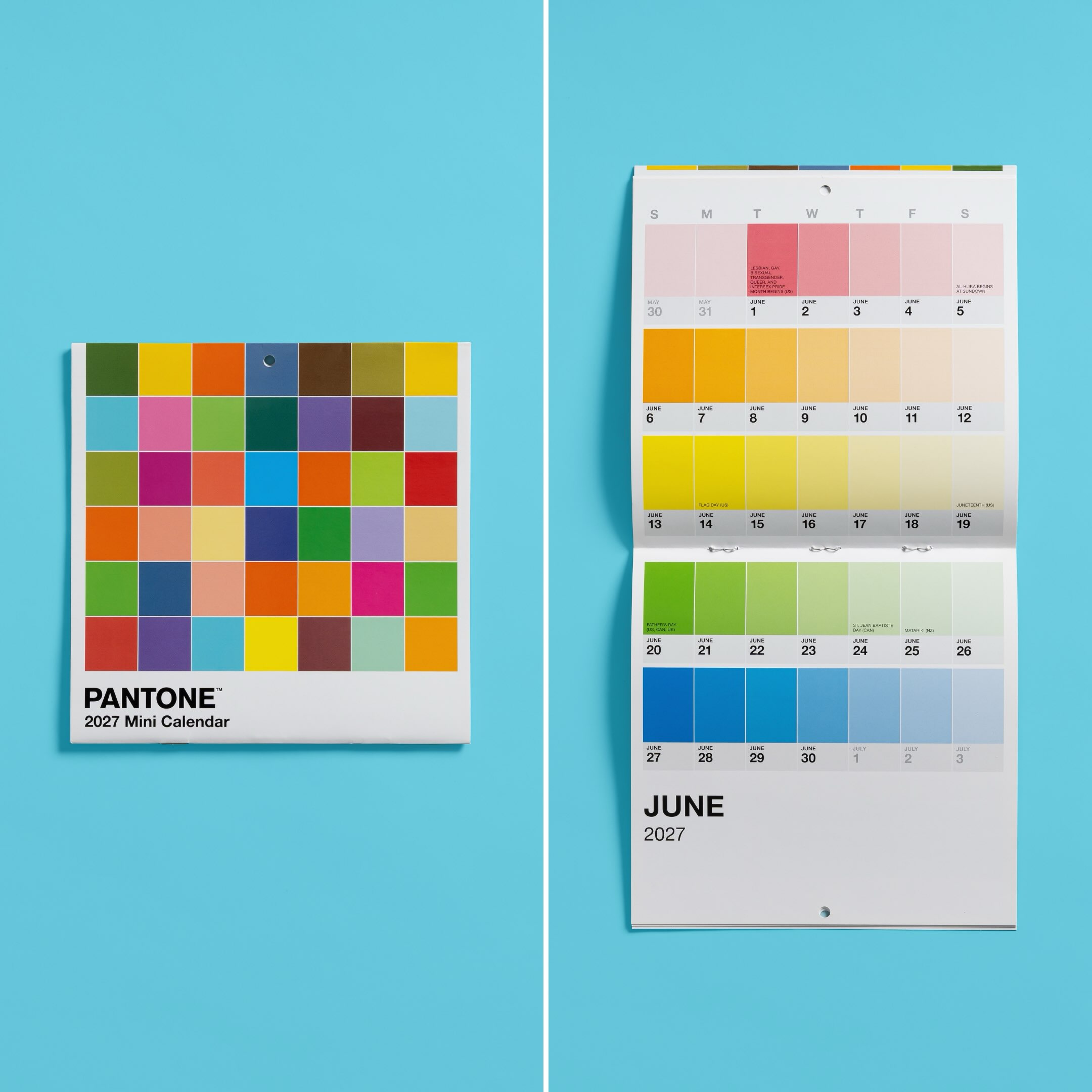
At $24.99, it is essentially a giant Pantone deck disguised as a calendar. There is also a $16.99 wall version featuring a different color each month and a smaller $9.99 edition designed for tighter spaces.
Pantone has also extended the idea into a broader holiday collection, including an Advent calendar, wrapping paper and a boxed set of games.
When The Brand System Becomes The Product
The interesting part is how little invention Pantone actually needed.
The white border. The block of color. The simple typography. The color reference underneath.
That visual system was created as a practical tool for designers, but decades of repetition have turned it into something instantly recognizable far beyond the design industry.
Now Pantone can take almost any object, apply that system and make it feel like Pantone.
The calendar works because the brand code is strong enough to become the entire product. There is no need for an elaborate collaboration or campaign concept. A year already consists of 365 individual units. Pantone simply assigns each one a color.
Plenty of brands use color to make themselves recognizable.
Pantone built a brand so strongly around color that it can sell the system itself.
Also Read: