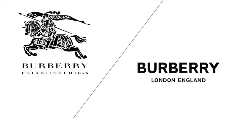
Burberry gave a famed London designer only 4 weeks to redesign its logo. The company’s Chief Creative Officer loves it. Fans are not convinced.
The house of Burberry hadn’t changed its brand mark for nearly two decades. So you would think they could have given some more time to do so. But the London-based luxury brand gave Peter Saville, a famed British designer, only 4 weeks to come up with a new logo.
The result is a modern, all-caps, sans-serif, minimalist, wordmark. While Burberry’s Chief Creative Officer loves it, the fans are not so convinced.

Fans were surprised by the new design, often judging it “cheap,” some even thinking the Facebook page of the brand had been hacked…
“The typeface for the original logo gave the impression of timelessness and I always associated it with style and class,” said another. “Now it just looks cheap.”
In an interesting twist, Burberry shared intimate details of the collaboration between Riccardo Tisci, the brand’s new CCO, and the designer Peter Saville. Images of their email conversations were shared on Burberry’s Instagram feed. Of course, the main topic was around the very short timeline given to Saville for the project who laconically replied:
“You need four months for a project like this!”
https://www.instagram.com/p/Bl-LSk1HXZA/
https://www.instagram.com/p/Bl-Lox3ne2Q/
https://www.instagram.com/p/Bl-L0SUnqIF
[box]Read next: Snapchat Starts Testing Sticker Packs Made By Creators[/box]
