Red is one of the most powerful colors in branding. It signals energy, urgency, emotion, appetite, danger, and recognition. But for NHS Blood and Transplant, the question is much more literal: what happens when the red disappears?
That is the idea behind “Emergency LOW-GOS”, a new campaign created with Havas London that strips the red from some of the UK’s most recognizable logos to raise awareness of a serious blood shortage.
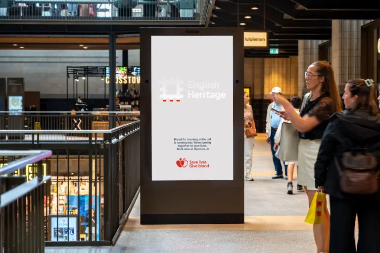
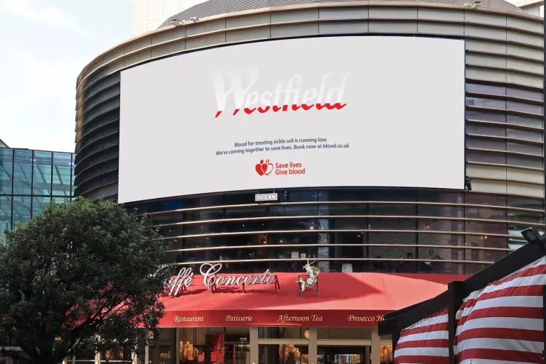
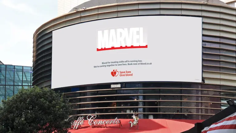
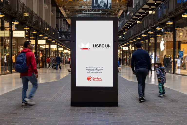
Launched on June 19, World Sickle Cell Day, the campaign appears across Ocean Outdoor screens in London, Manchester, and Birmingham. Logos from Marvel, HSBC UK, Westfield, English Heritage, and The Independent are shown without their signature red, turning a familiar brand asset into an urgent public health message.
The missing red becomes the message
The creative idea is simple, but immediately readable. The red missing from each logo becomes a visual metaphor for the blood missing from NHS supplies.
Instead of explaining the shortage through statistics alone, the campaign makes absence visible. A logo drained of its red becomes a symbol of reserves running low. It is a clever use of brand recognition because the viewer knows something is wrong before they even read the message.
That is what gives the work its strength. It does not need to over-explain. It takes something people see every day, alters it just enough to create discomfort, and turns that moment of recognition into a call to act.
A brand donation with real creative weight
What makes the campaign especially smart is the way it reframes brand participation. These companies are not just lending media space or adding their logos to a charity campaign. They are allowing one of their most protected assets to be visibly changed.
For most brands, the logo is sacred. The colors, spacing, proportions, and usage rules are protected with strict guidelines. Here, the impact comes precisely from breaking that rule in service of a bigger message.
Disney, a long-standing NHS Blood and Transplant partner on the idea, helped open the door through Marvel. HSBC UK, Westfield, English Heritage, and The Independent also joined the campaign, each allowing their visual identity to become part of the alert.
It is a donation of visibility, but also a donation of control. And that is what makes the gesture feel meaningful.
The real medical need behind the visual idea
Behind the striking creative device is a very specific medical need.
The campaign is tied to the shortage of blood used to treat people living with sickle cell disease. Many sickle cell patients require blood from the Ro subtype, but NHS Blood and Transplant is currently facing a significant gap between supply and demand.
According to the campaign, the NHS provides around 3,600 units of Ro blood per month, while patients need approximately 7,400 units. That creates a shortfall of around 50 percent.
The appeal focuses on Ro, O negative, and B negative donors, with a particular call to people of Black African and Caribbean heritage, who are more likely to have the Ro subtype needed by patients with sickle cell disease.
That targeting matters. This is not a generic “please donate blood” campaign. It uses a broad public visual idea to point toward a specific and urgent donor need.
A campaign designed to be reactivated
Emergency LOW-GOS also works because it has the structure of an emergency system, not just a one-off awareness stunt.
The campaign won £75,000 of media space through Ocean Outdoor’s annual creative competition, giving the idea a high-profile public platform. But its real value is in its repeatability.
Because the concept is built around shortage and urgency, it can be reactivated whenever blood stocks fall. The same visual mechanism can return with new brands, new locations, and new moments of need.
That makes the idea feel closer to brand utility than traditional awareness advertising. It gives NHS Blood and Transplant a recognizable creative asset that can be deployed when the issue becomes urgent again.
Emergency LOW-GOS succeeds because it understands the cultural power of logos. People may not think much about the color red in a logo until it disappears. That absence creates a pause, and the pause creates attention.
For participating brands, it is a rare example of visual identity being used not to reinforce recognition, but to disrupt it. For NHS Blood and Transplant, it turns a public health message into something instantly legible in the street.
The campaign does not ask brands to shout louder. It asks them to give something up. And in this case, losing the red makes the message impossible to miss.
Also Read:
Lipton Is Turning Local Creators Into Its Social Teams
Scotch-Brite Turns Its Sponge Into a Brazil Jersey
Will Consumers Care If Influencers Aren’t Human?