
In an effort to improve Search and help users discover better information more easily, Google has updated the design of its mobile search results page.
The “visual refresh” as Jamie Leach, Senior Interaction Designer for Search at Google calls it in a recent announcement was made “to better guide you through the information available on the web.”
One of the ways it does so is that it brings a website’s branding into the search results, allowing you to find results faster, by better understanding “where the information is coming from.”
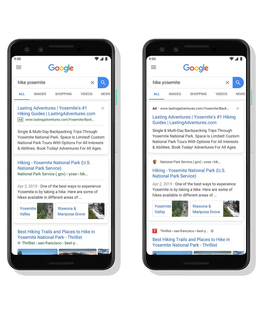
The website’s name and favicon will now appear at the top of the results “to help anchor each result,” and help you more easily scan the results. Site owners will have to choose a prefered icon for organic listings. You can find more information on how to do this here.
Also, when you search for a product or service and an ad would normally show, you’ll now see a “bolded ad label at the top of the card” together with the website’s address. This allows you to quickly understand where this information is coming from.
The new design also allows space for “more action buttons and helpful previews to search results cards,” while at the same time giving a better idea of a website’s content – with clear attribution directly back to the source.
For the time being, the updated design is only coming to mobile and is rolling out within the next few days.
[box]Read next: Google Updates Its Google Ads Mobile App, Teases Expansion Of Local Campaigns[/box]