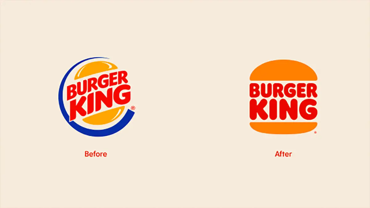
The new Burger King logo was designed by the agency Jones Knowles Ritchie. It’s the Home of the Whopper’s first brand redesign in 20 years.
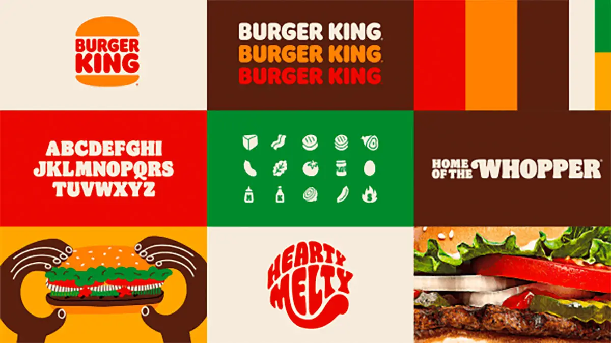
The brand redesign includes a new logo, packaging, restaurant merchandise, menu boards, uniforms, restaurant signage, and decor, as well as social media, digital, and marketing assets.
Related | New Facebook Pages Come Without A Like Button
The new Burger King logo has a custom serif typeface and retro colors that mimic the organic shapes and colors of Burger King’s core menu items. It looks cool, fresh, yet vintage, and very distinctive from BK’s competitors.


Burger King’s new identity follows a trend started by several major brands across sectors that have been flattening and simplifying their look. The goal is clearly to make their identity work better in digital spaces.
The redesign emphasizes freshness of ingredients in an industry that suffers from a bad reputation. “We wanted to use design to close the gap between the negative perceptions people have of fast food and the positive reality of our food story by making the brand feel less synthetic, artificial, and cheap, and more real, crave-able, and tasty,” says Lisa Smith, Lisa Smith, executive creative director at Jones Knowles Ritchie, who worked with Rapha Abreu, vice president and global head of design at Restaurant Brands International to bring the identity to life.
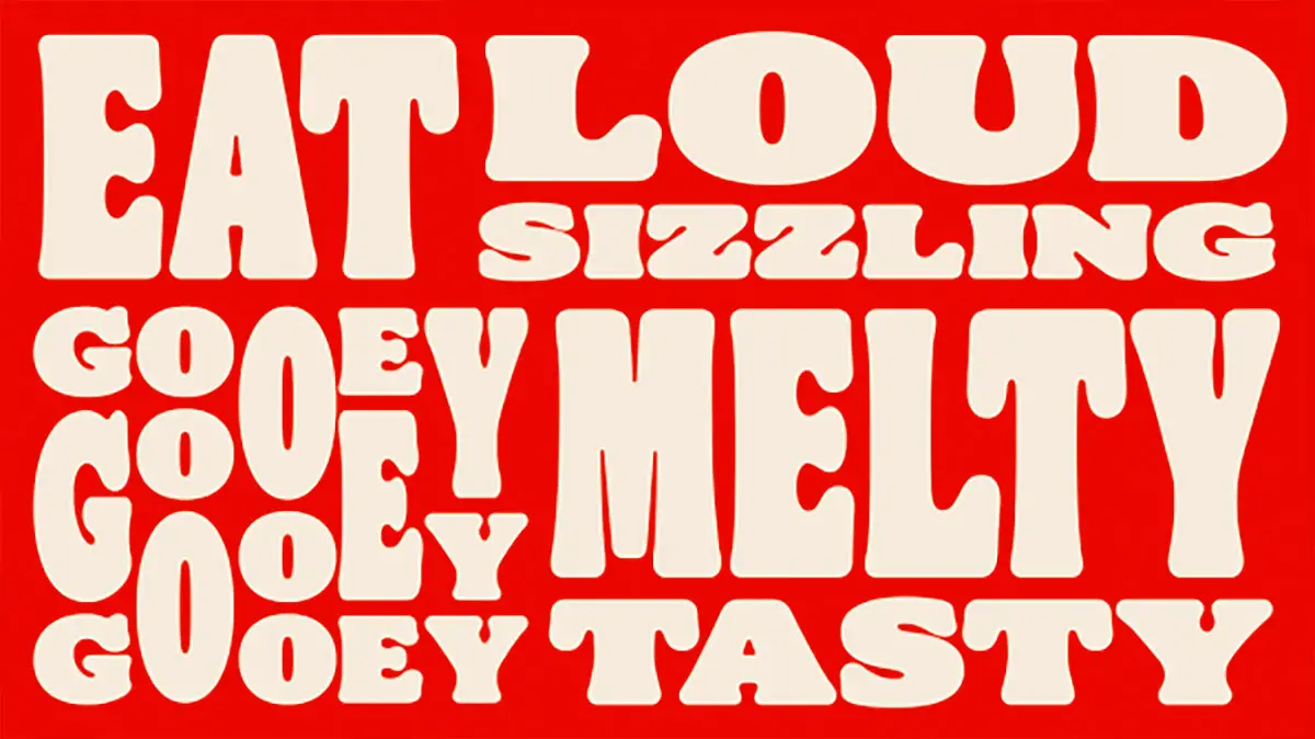
The new identity has a custom variable typeface called “Flame.” It is a groovy semi-serif typeface that looks a lot like the ever popular ’70s typeface Cooper Black. Smith explained the reasoning behind it: “Obviously sans serifs have fallen into what has become a trend of blanding, where there’s nothing distinctive about that brand. The idea with developing this typeface Flame was that it led us back to creative principles of ‘mouth watering’ and having the irreverence evoke natural organic shapes of food. It looks a little bit squishy and delicious so you can almost taste the typeface.”
The new identity package also includes a set of playful illustrations by Spanish duo Cachete Jack, which gives the company a new way to brand everything from digital ads, social media visuals, and even the paper that goes on top of your tray when in a restaurant.
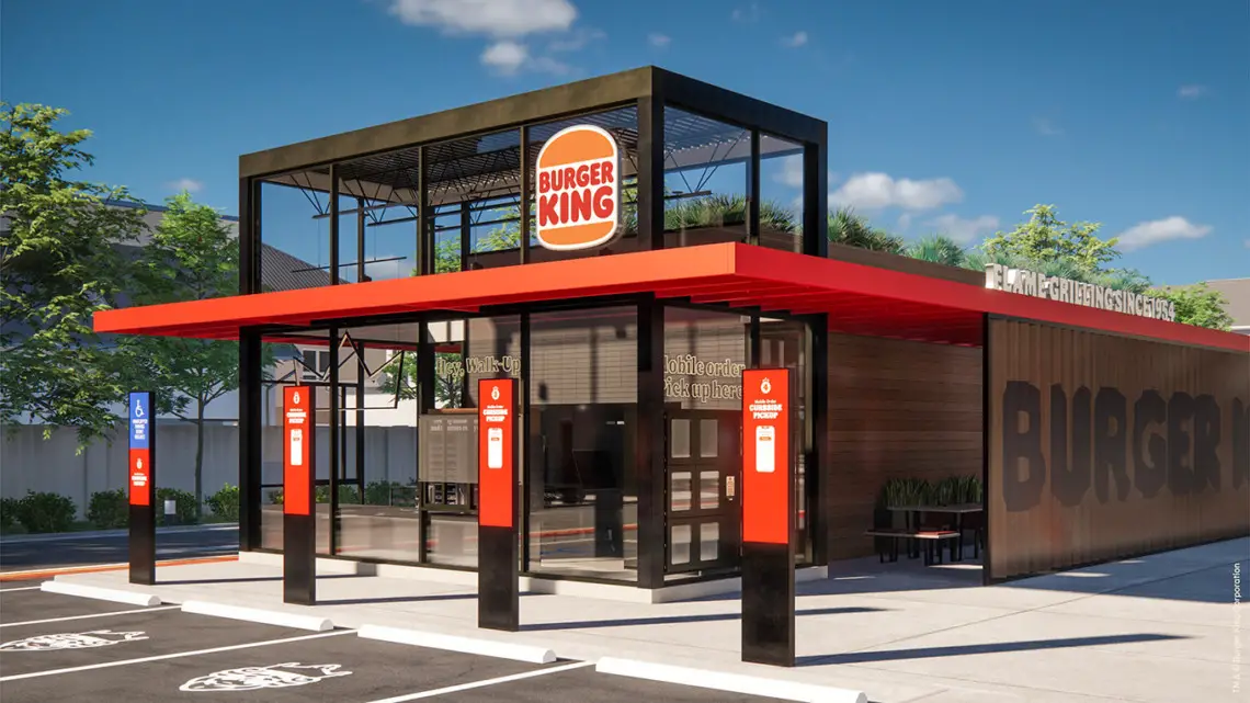
Finally, Burger King will also update its restaurant signage to reflect its new look.

