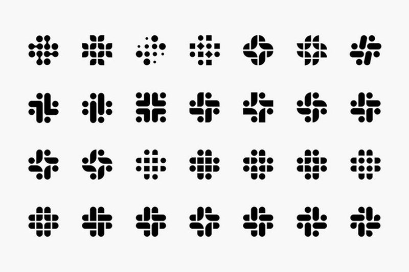
Slack revealed its new logo today, a redesigned version of its # logo. All good, except some people are finding there is something really wrong with the white space.
Launching a new logo is always a stressing moment for a brand. Are people going to like it? Does it represent our values? Will people understand it is still us? So oftentimes, just like Slack did, brands come up with over-detailed explanations as to what the thinking behind the rebranding was.
Slack calls the design “simpler” and brings a more artistic style to the aging grid (#) shaped logo. The colors(light blue, magenta, green and yellow) stay the same but the new design gets rid of the translucent overlaps.

The new logo is the work of New York firm Pentagram Design and “it uses a simpler color palette and, we believe, is more refined, but still contains the spirit of the original,” the company writes. “It’s an evolution, and one that can scale easily, and work better, in many more places.”

Great. Except that, like for all redesigns, some people are seeing something they don’t like about the new slack logo. Essentially, some Twitter users are raising questions around the negative space (white space):
https://twitter.com/HeyHeyESJ/status/1085613709286764544
https://twitter.com/Sean8UrSon/status/1085615669951881216
This obviously seems like an unintentional honest design mistake, but the negative space forms a shape reminiscent to an ancient symbol that later became the symbol of the worst people, ever (to quote TechCrunch).
Many designers are now sharing this point of view and explain that it could eventually cause the downfall of the new design. Can you see it?
[box]Read next: An Egg Is Now Instagram’s Most-Liked Post Ever[/box]
