
Only a month after introducing its new identity, Slack has once again updated its design. And we will miss the “ex-new” purple logo.
One month, that’s all it took for Slack to revise its new logo. And while you may have thought they had done so following the uproar of people who were seeing a hidden swastika in the negative space, you would be wrong.
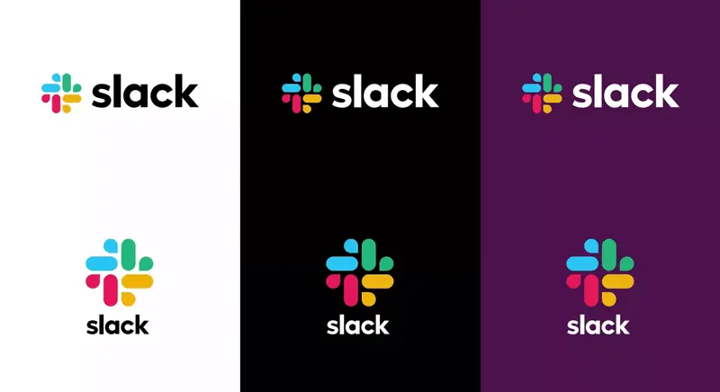
No, the update is about the background. That nice purple background that was the only thing most of us found interesting about the new design. It seems Slack is more interested in making its logo as generic as possible. Gone is the nice purple background that made the app stand out on our phones and desktop. It has now been replaced by a white (boring) color.
Although Slack seems to be convinced of the exact opposite:
Starting today, you may notice your Slack mobile app icon change from purple to white. This should make it a little easier to see on your device. Visit the Google Play or Apple App Store to update.
— Slack (@SlackHQ) February 26, 2019
Because, yes, a colorful “spin wheel” on a white background is a novelty in the app world…
https://twitter.com/drmzio/status/1100482311106179072
I will miss the purple. What about you?
[box]Read next: A Look Back At 10 Years Of WhatsApp[/box]