In January, retail advertising usually turns into a numbers arms race. Aggressive discounts, “prices slashed” promises, screaming typography, a battlefield is paved with percentages. IKEA takes a radically different route: it refuses to fight on price… while quietly reminding everyone it still wins on it.
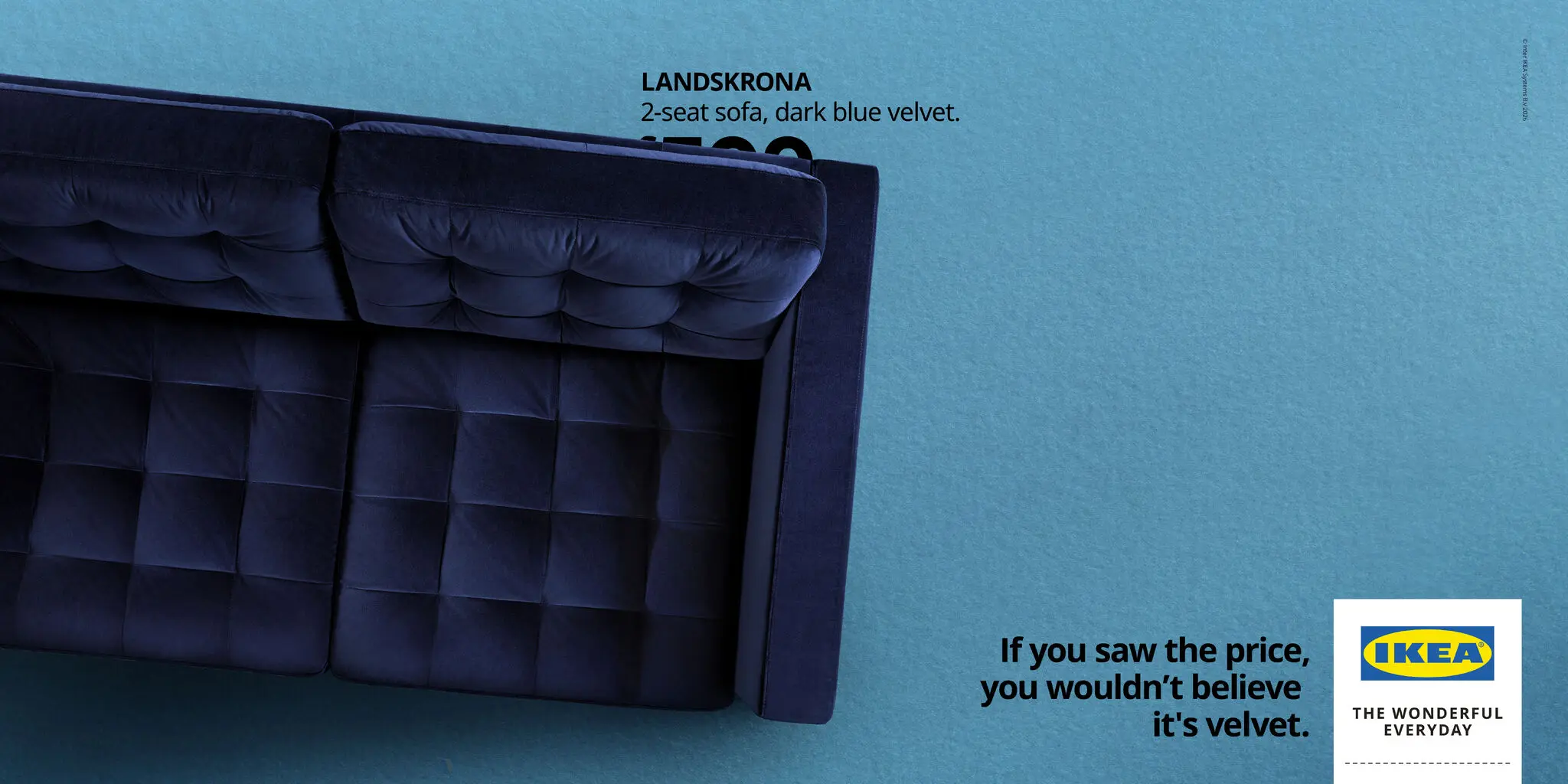
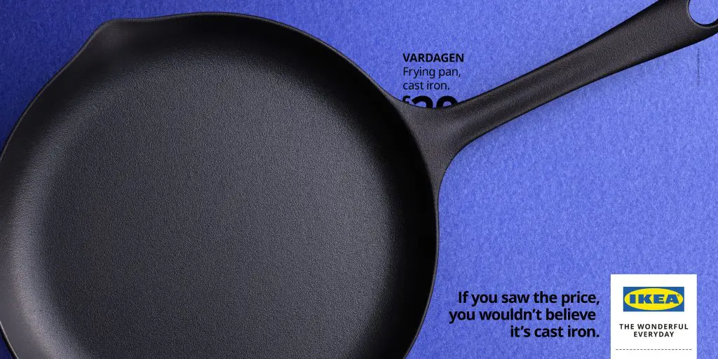
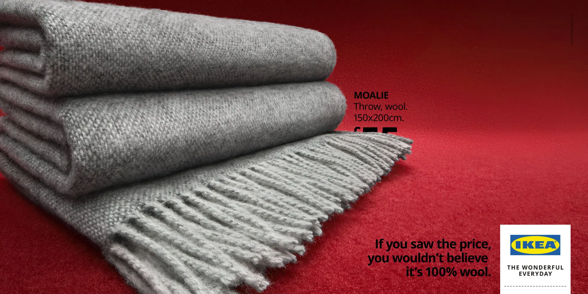
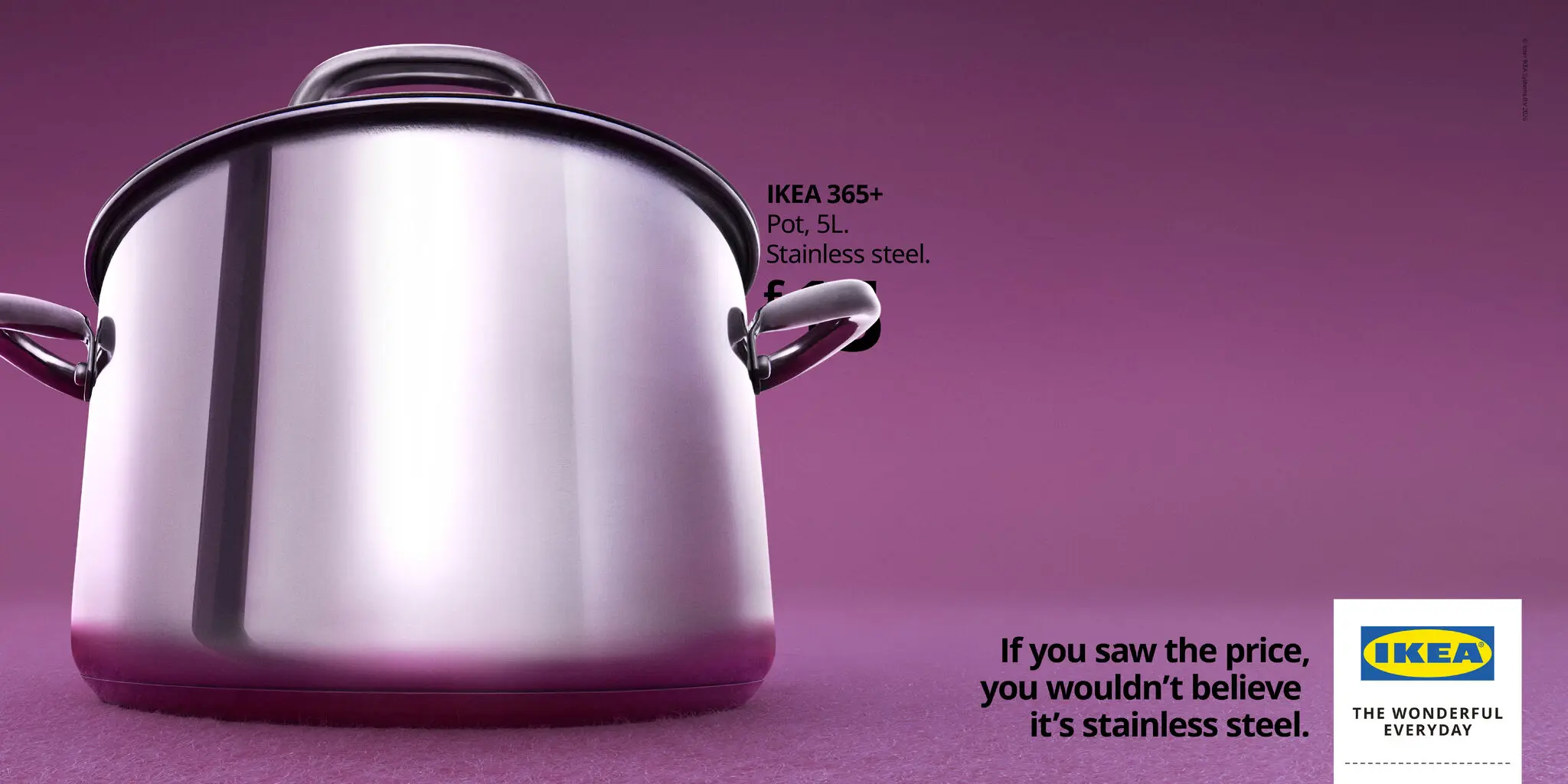
Working with Mother London, the brand launches a print and OOH campaign that flips a classic consumer reflex. Instead of grabbing attention with a price tag, it hooks the eye with materials. Solid wood, wool, cast iron, velvet. The product itself becomes the proof, and the price a deliberate, conspicuous omission.
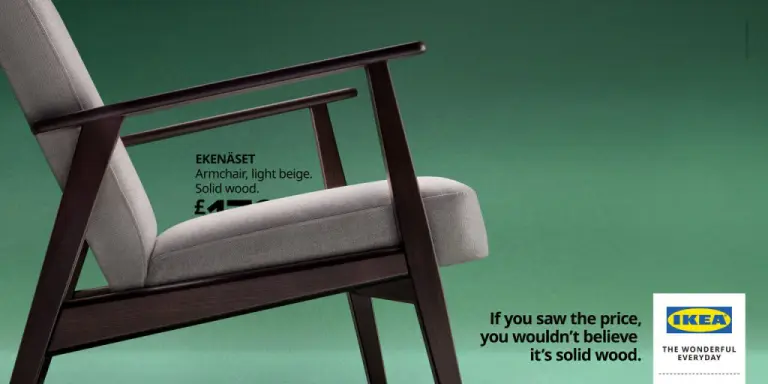
The visuals are stripped back and tactile, built like portraits of materials. Shot in extreme close-up, IKEA products abandon the familiar “catalog look” in favor of something closer to editorial photography. You’re no longer seeing a chair or a throw, you’re seeing fibers, grains, textures.
Photographed by Marloes Haarmans, the series leans on bold color fields that isolate each object and make it instantly legible. It’s a simple device, but a powerful one: by removing visual noise, IKEA forces your attention onto what you’d normally skim past.
The campaign’s copy is built as a twist. Each execution opens with the same promise: “If you’d seen the price, you’d never believe that…” then lands on a material truth: “…it’s cast iron,” “it’s velvet,” “it’s 100% wool.” The number never appears; instead, the gap between expectation and reality does the talking.
That mechanism works because it triggers an automatic response. Viewers mentally complete the sentence, anticipate a deal, then collide with the perceived “nobility” of the material. Paradoxically, hiding the price makes it feel more present, hovering as an obvious conclusion and amplifying the sense of value without ever stating it.
At a moment when everyone else is shouting discounts, IKEA doubles down on a long-held position: accessible design can coexist with quality materials. By shifting the conversation from cost to value, the brand wins twice, reasserting its competitiveness while elevating product perception.
Creatively, the wink is intentional. Running a price campaign… without prices becomes a commentary on our own biases. We struggle to believe quality and affordability can live together, so IKEA proves it the quiet way, letting materials speak, and turning the absence of numbers into a confident statement.
Also Read:
IKEA’s $4 Charger Is The Kind Of Product That Quietly Makes Sense
IKEA Just Launched the Most IKEA Product Ever
IKEA’s Hidden Labels Just Became Its Greatest Ad