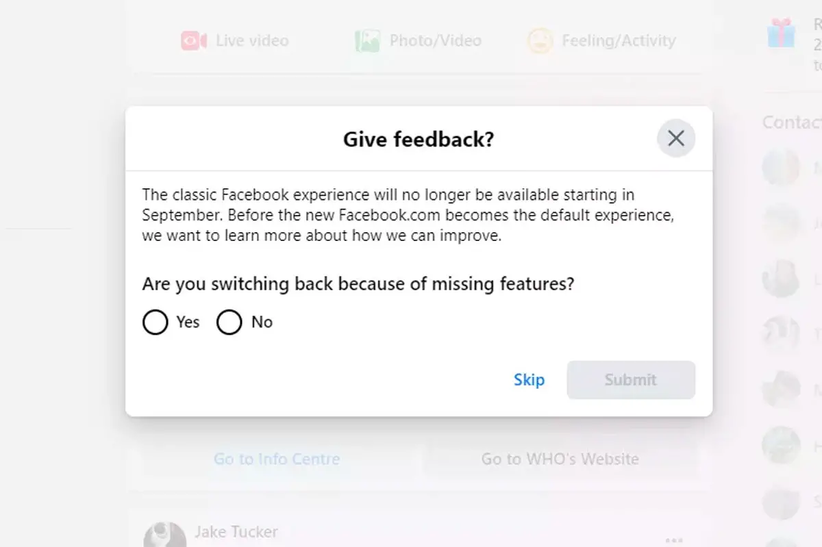
Facebook’s classic web design will cease to exist in September this year. All users will automatically switch to the new layout.
Facebook’s experience has not changed much over the past 10 years. So, come September, it will be a shock for many users when they log in into their account to discover Facebook’s new layout.
Related | Twitter Now Provides More Context About Who Sent You DM Requests
Announced last year during F8, Facebook’s new web design was first rolled out on iOS and Android app. A few months later, it became available to some desktop and web users as an optional update. Until now, users who had chosen to test the new layout had the option to switch back to the classic interface but that will stop to be the case when everyone is automatically switched to the new design in September.

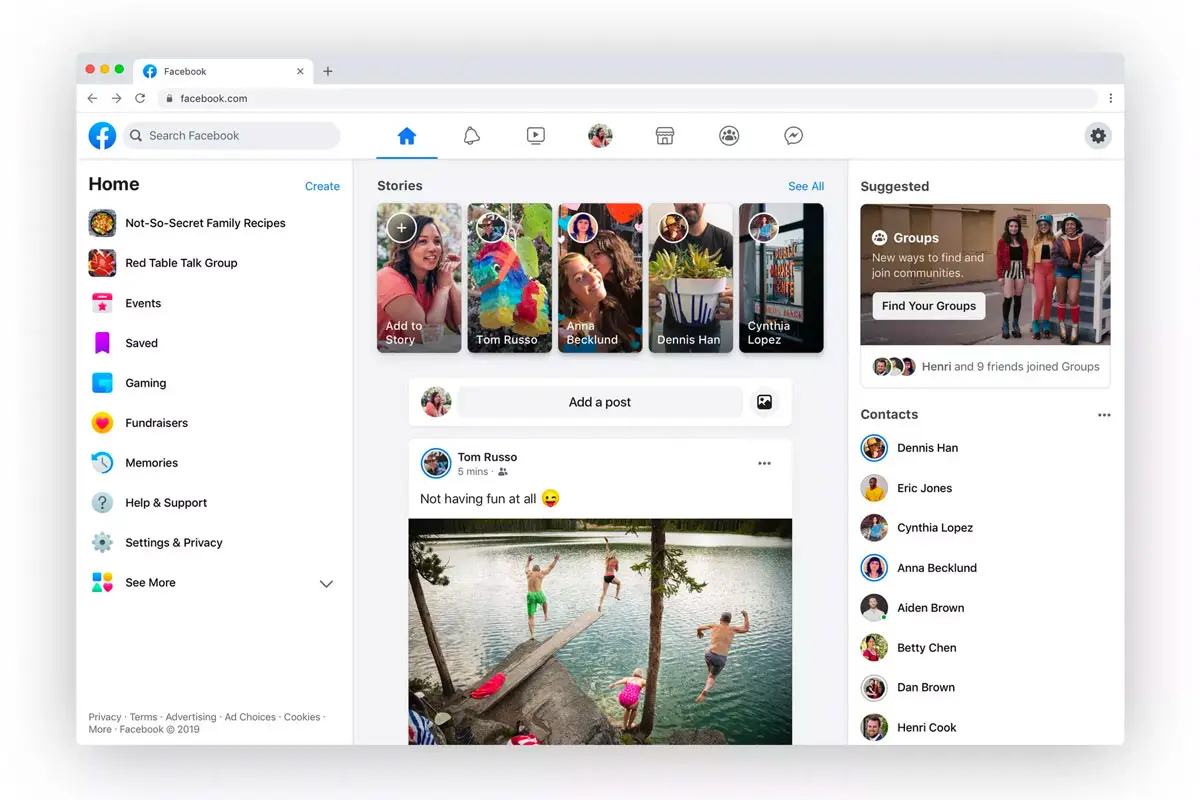
But do not worry. Even if you might feel a bit confused at first, the new layout provides a much-improved experience once you will get used to it. For starters, it is a lot cleaner, includes a lot more white space and a lot less clunky blue. The new layout brings focus to Groups as well as Watch, Marketplace, Facebook’s own gaming section, and the new Rooms feature.

Last, but not least. Facebook’s new web design offers a dark mode. I tested it, and never looked back.
That being said, the new layout has had some bugs over the past few months. A general update could mean Facebook has now resolved any potent issues.
