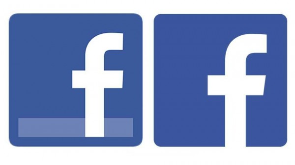
You may not have noticed but Facebook recently has revamped its logo. The new logo aims to look more modern by bringing in the “f” close to the edge of the logo and by getting rid of the “blue underlining bar”. What do you think?

The update of its main logo comes after new logo were dispatched for many internal applications, such as developer, security & privacy or even security:
![]()
The new identity was spotted when Facebook launched its newly redesign app for iOS and iPad this last tuesday.
The line chosen by facebook reinforces the blue presence and declines it through all of its app icons. I think this is actually a good move by the #1 social network who once again makes sure blue means Facebook! Tech Crunch also notes that the “flat” design chosen by Facebook relates to a trend slowly taking over the tech industry.
[READER] What do you think of the new logo?
