Living in New York should probably come with an instruction manual. Fortunately, IKEA has decided to write one.
To announce the opening of its upcoming SoHo store, IKEA has covered the building’s construction façade with enormous assembly instructions explaining how to navigate everyday life in New York. Created by DAVID New York, the campaign transforms one of the brand’s most recognizable visual assets into a surprisingly accurate guide to surviving the city.
Tiny apartments, expensive dates, impossible laundry logistics and the eternal struggle to recover your security deposit. Apparently, IKEA has instructions for all of it.
New York Life, Some Assembly Required
The creative idea is wonderfully simple. Take IKEA’s famous illustrated assembly manuals, replace the furniture-building scenarios with recognizable New York situations and use actual IKEA products to solve them.
One instruction sheet explains how to have “more than one night stand” by positioning two bedside tables and lamps around a bed. Another demonstrates how to survive living in a shoebox apartment using KALLAX shelving and BLÄDDRA storage boxes, with just enough room left for a cat.
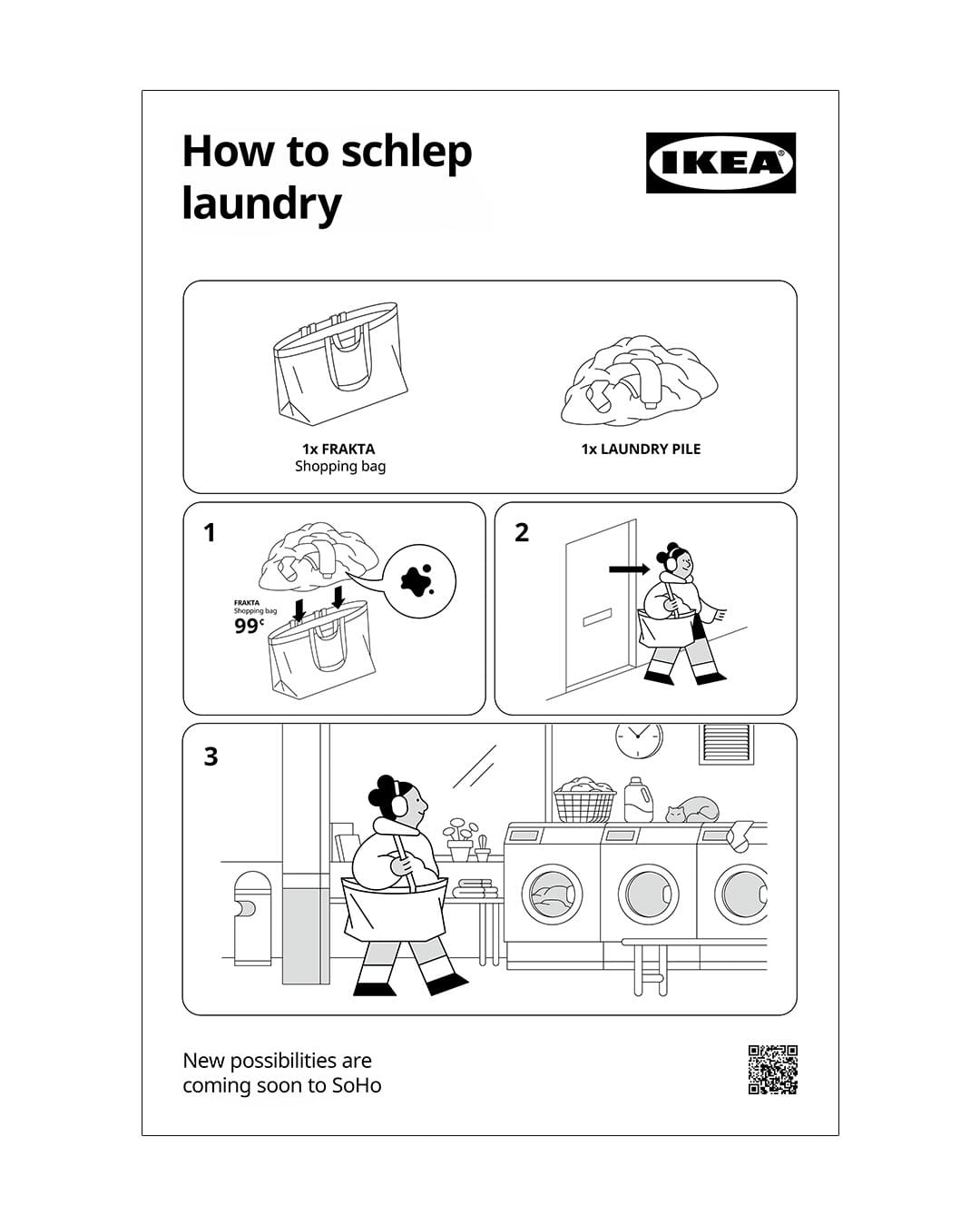
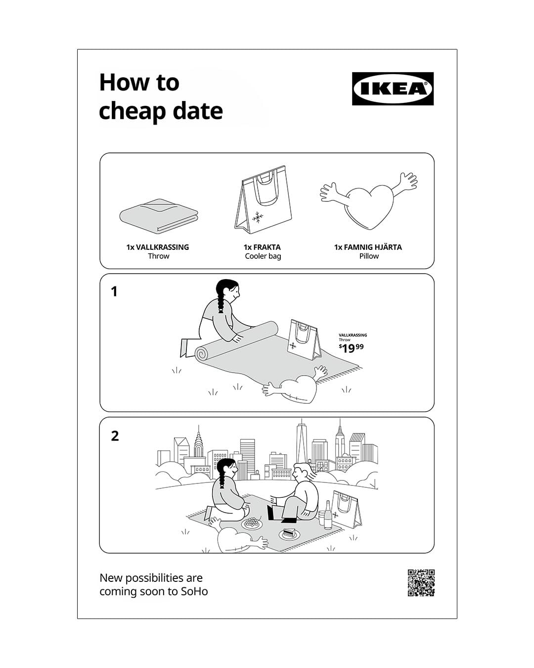
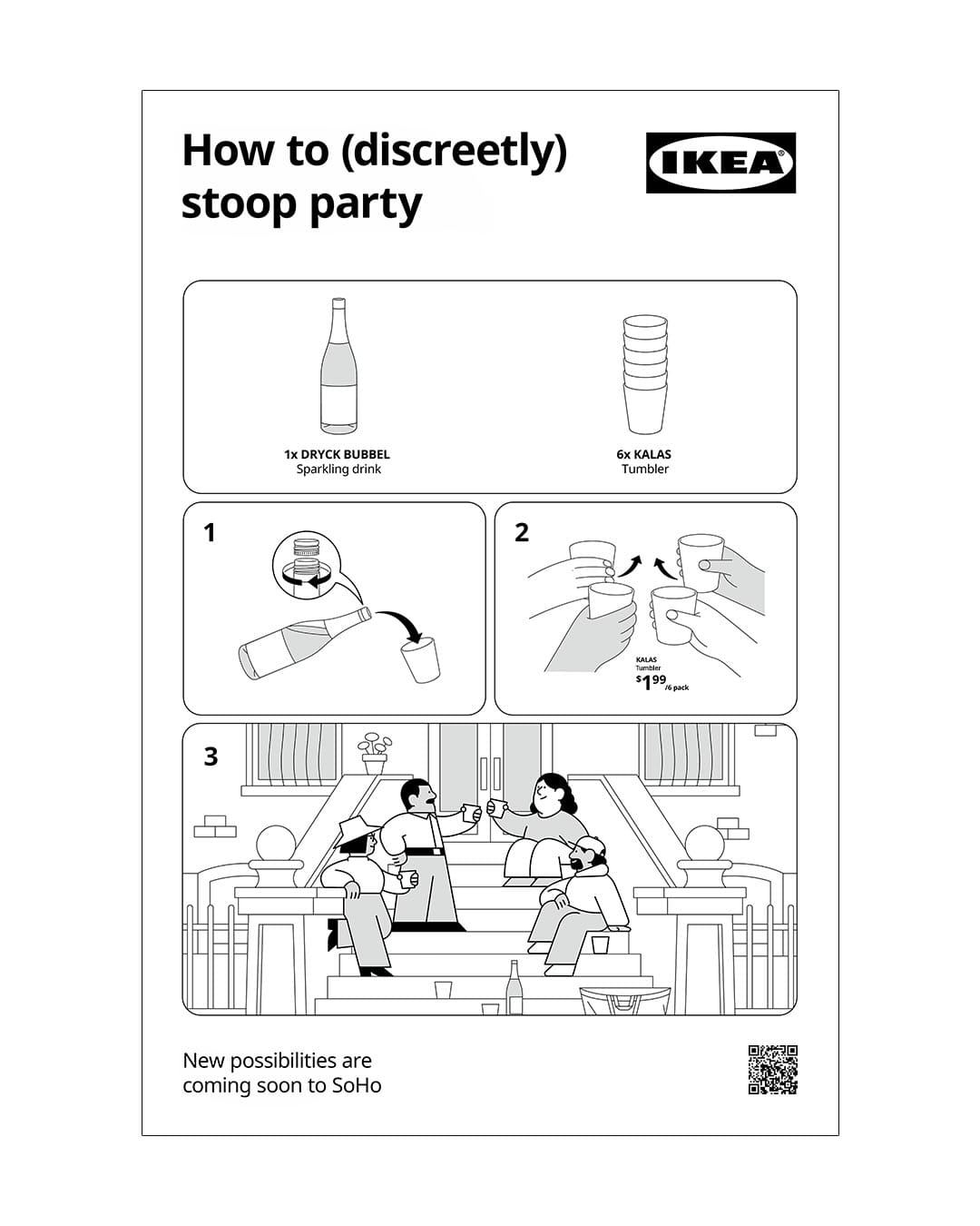
Doing laundry in New York? Grab the iconic blue FRAKTA bag. Planning a cheap date? IKEA suggests a blanket, an insulated bag and a heart-shaped cushion. Want to throw a party on your stoop without disturbing the neighbors? There is apparently an assembly guide for that, too.
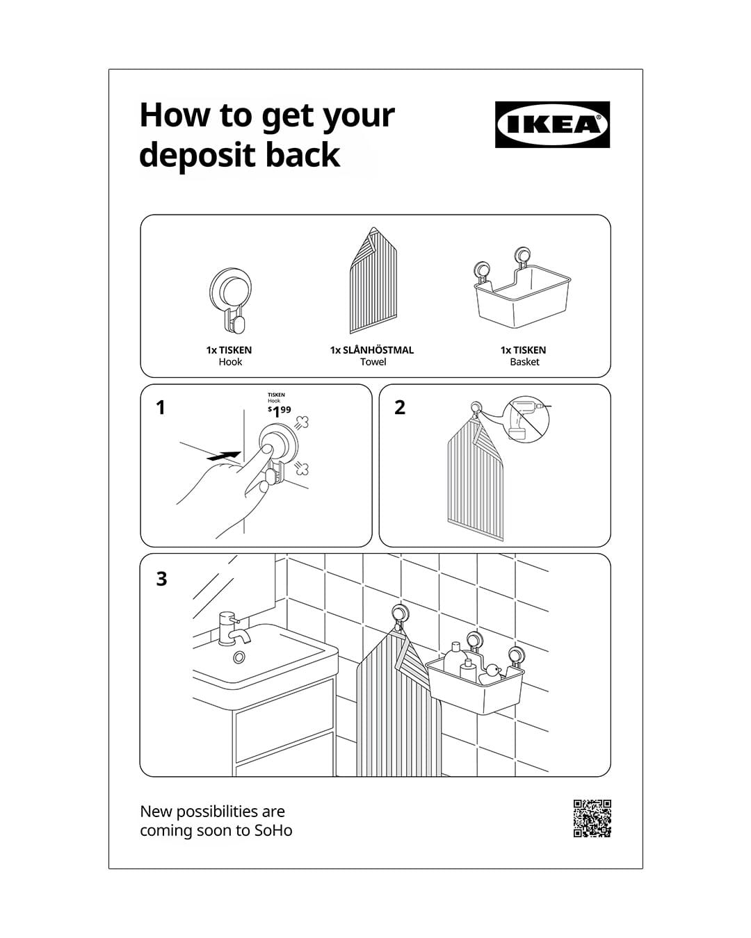
The campaign even tackles some particularly New York problems, including dividing a studio into two bedrooms, getting enough sleep in the city that never sleeps and installing hooks without drilling holes so your landlord will actually return your security deposit.
Each execution uses the familiar IKEA visual language: minimalist illustrations, numbered steps and recognizable products. The humor comes from treating the frustrations of city living with the same straightforward practicality as assembling a bookshelf.
The Construction Site Becomes The Advertisement
There is another clever detail to the execution: where IKEA decided to display the campaign.
The oversized instructions cover the façade of the company’s future store at 529 Broadway, on the corner of Spring Street. The building is still under construction, making the entire installation look as though the new IKEA location is itself being assembled.
The advertising medium becomes part of the creative idea.
The new SoHo store is expected to open in fall or winter 2026, bringing IKEA into one of Manhattan’s busiest shopping neighborhoods. Unlike the enormous suburban locations most Americans associate with the retailer, the new store will have a smaller urban format, with furniture and home accessories, planning services and convenient access to products.
The campaign introduces that proposition without relying on conventional retail advertising. Instead of announcing another furniture store, IKEA demonstrates that it understands the practical realities of living in the neighborhood it is about to enter.
A Brand Code That Needs No Explanation
What makes this campaign particularly interesting is how little traditional branding it needs.
IKEA’s assembly instructions have become so recognizable that the illustrations themselves effectively function as a brand identity. Their minimalist characters, visual simplicity and unmistakable step-by-step format are enough for people to recognize IKEA without needing to see a giant logo.
DAVID New York takes advantage of that familiarity while introducing something equally important: local relevance.
The creative team could have used any number of generic furniture-related jokes. Instead, it built the campaign around experiences that New Yorkers recognize immediately, translating local expressions and everyday frustrations into IKEA’s visual language.
It’s a smart example of adapting a global brand to a local culture without compromising its identity.
And IKEA has been exploring this creative territory for years. In 2020, the brand and agency Instinct used the same visual system to create illustrated instructions for building children’s forts from IKEA furniture during lockdown.
The format works because it is familiar, flexible and unmistakably associated with IKEA. Once a brand owns a visual language this distinctive, it can use that language to communicate ideas far beyond the products it originally described.
IKEA Understands The Value Of Its Own Assets
There is an interesting pattern emerging across IKEA’s recent campaigns.
In Italy, the company turned the unexpected ways customers use its FRAKTA bag into an advertising campaign. In Sweden, the same bag became a camera framing everyday life. In Canada, IKEA used the literal translations of its Swedish product names to explore the emotional meanings customers attach to their furniture.
Now, in New York, its assembly manuals have become a guide to urban survival.
These ideas have something in common. Rather than inventing new creative devices for every campaign, IKEA keeps finding new ways to use the distinctive assets it has spent decades building.
And in SoHo, the brand takes that approach one step further by making the physical location part of the execution.
The store is being assembled. The city apparently needs assembling. And IKEA conveniently sells all the pieces.
It’s an incredibly simple idea that connects the brand, its products, the location and the people living around it.
New York might not come with instructions.
But IKEA is happy to provide them.
Also Read: