7UP has done something wonderfully small and surprisingly disruptive: it has put lime before lemon.
In the US, the soda is permanently changing from “lemon-lime” to “lime-lemon,” introducing a more lime-forward recipe across 7UP Regular, Zero Sugar, Cherry and Cherry Zero Sugar. It is the brand’s most significant flavor change in more than 15 years and will begin replacing the current formula on shelves in mid-August.
The new drink still contains lemon. The sweeteners have not changed. Early taste tests suggest the difference is noticeable but restrained, with Allrecipes describing it as slightly zestier, a little less sweet and difficult to identify in a blind comparison.
The bigger change may be what happens before anyone opens the can.
Two Words That Suddenly Feel Wrong
“Lemon-lime” is one of those combinations that culture has placed in a fixed order. Like salt and pepper or knife and fork, the words arrive as a pair and reversing them makes the phrase feel immediately strange.
That gives “lime-lemon” unusual strategic power. It does not simply describe the new recipe. It demonstrates the change every time someone says it, reads it or hesitates over it.
Most reformulations need a campaign to explain what is different. 7UP has created a phrase that makes the difference felt before the product is tasted.
The company says the shift is informed by younger drinkers’ preference for bolder citrus flavors. Under the “Flip the Sip” platform, lime becomes both the product story and the challenger gesture, a way for 7UP to distinguish itself in a category dominated by Sprite and crowded by similar promises of crispness and refreshment.
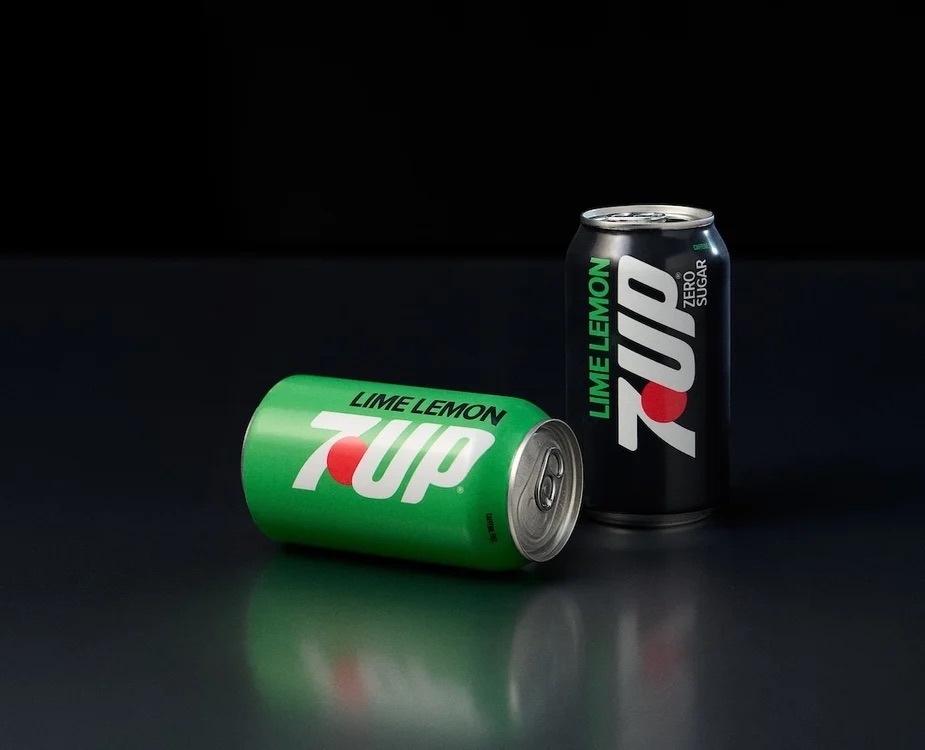
The Product, Language And Pack All Flip Together
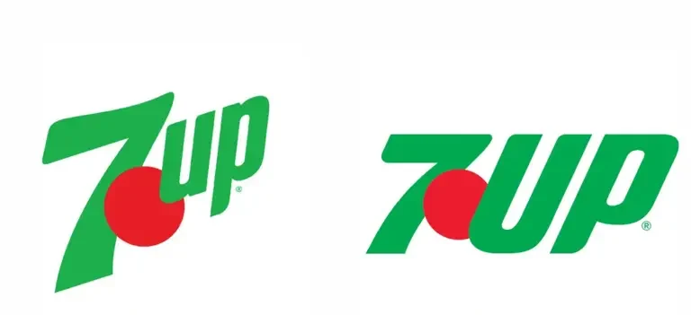
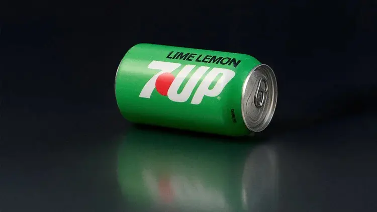
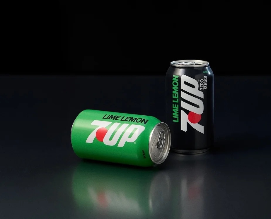
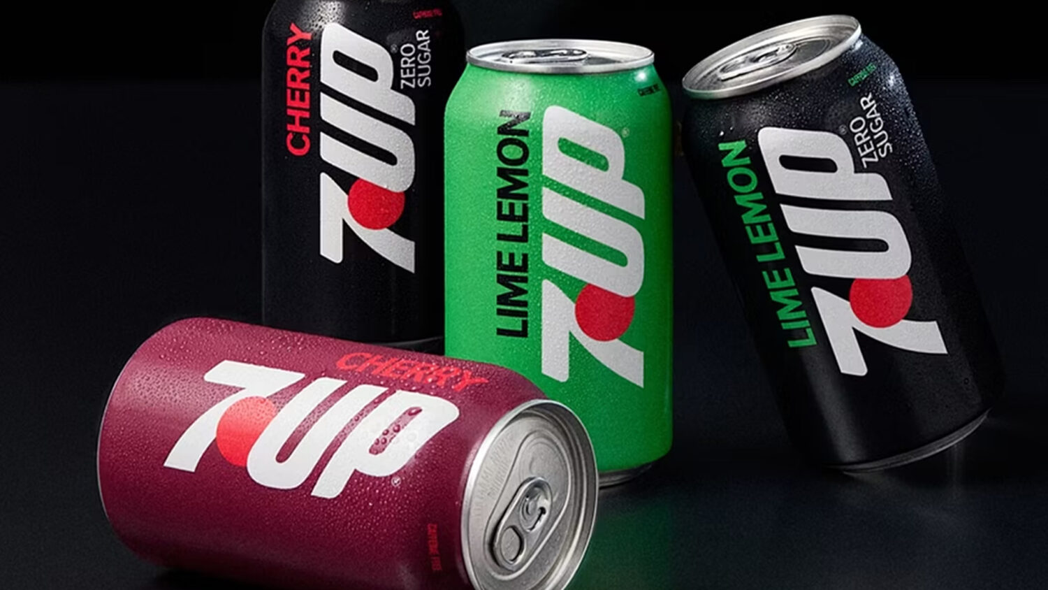
The visual identity makes the same move. Developed by Keurig Dr Pepper with Deutsch LA, the packaging introduces a large vertical presentation of the logo, solid color fields and a more prominent “Lime Lemon” designation. The familiar red dot now sits behind the U and above the 7, preserving a recognizable brand asset while changing how the mark reads on shelf.
The core can stays bright green, Zero Sugar moves into black and Cherry adopts a deep burgundy. According to Creapills, the recipe took two years to develop and the design process explored ten different directions rooted in the brand’s archives.
There is also a useful piece of heritage behind the change. 7UP built its US identity around being “The Uncola,” a challenger to the category’s dominant conventions. Putting lime first brings that instinct into a different era. It is less rebellious than rejecting cola altogether, but the mechanism is similar: take the rule everyone accepts and invert it.
That is what makes this more than a recipe update or another retro-leaning redesign. 7UP has aligned the product, the words and the package around one simple act of reversal.
The new formula may only taste a little different. “Lime-lemon” makes it sound like nothing else.
Also read:
Chupa Chups Launches An “Impossible” Lollipop To Tease Its New Packaging
Pepsi Takes A Shot At Coca-Cola’s Polar Bears
Heinz Adds A Dial To Its Ketchup Lid For The Perfect Squeeze